
Lab instructions on creating PBI reports from scratch.
Introduction / Context
End outcome
At the end of this exercise, you should be able to produce a report looking like this:
-
[Overview Tab]

-
[Profit Tab]

-
(Hidden) [Product Details Tab]

-
(Bonus) [Performance Tab]

Support files (for info):
- If using SQL DB, use Database backup, and Database Object Creation Script
- Alternatively, if using data Extract, use AdventureWorksDW Extract
Stage 1: Connect with Data Source
- Open Power BI (PBI) Desktop Utility
- Click on Get Data
- If you are connecting with SQL Server Database, click Connect. Key in Server and Database details as provided by the instructor. Ensure Import option is selected for Data Connectivity Model.
- If you are connecting with Excel based data extract, download the extaract from here . Select Excel as Data Source and browse to location for this extract file (locally).
- Toggle on / check the checkbox for following entities:
- DW.DimDate
- DW.DimProduct
- DW.DimReseller
- DW.DimSalesPerson
- DW.FactSales
- DW.FactSaleQuota
NOTE: In this exercise all the aforementioned entities are in ready-to-consume state. In some real world scenarios, you might need to source the data and then cleanse/ transform it for your or business specific consumption.
- Click on Load button.
Explore the PBI Desktop areas like Model, Transformations, Report etc.
At end of this stage, you must be on Report view (left bar). This is where you can start creating your visuals, report pages etc. Please take a note of other options on this bar (Data and Model views).
Stage 2: Establish Wireframe or Report Outlook
- Discuss or explore the need for a report wireframe.
Stage 3: Create Report Pages and Visuals
Report 1 / 3: Overview
-
Add Logo
Download the Adventureworks Logo file locally from this URL.
a. Click on Insert -> Add an image to your report menu options
b. Provide the downloaded file’s path in Filename textbox, and click Open.
c. Logo / Visual should be visual on left-top corner of your report. Ensure its selected, and then go to Format Image -> General. Change Width and Height to 120. Also, add AdventureWorks Logo. Black semi circle, with yellow start in the middle, and connected green mountains at bottom as Alt Text.
d. Click anywhere in the empty report screen area.
-
Fiscal Year Slicer (Drop down)
a. Under Fields (right side), check the checkbox in front of DimDate : FiscalYear. Under Visualization, select Slicer (visual).
b. Change the visual to use Dropdown (hover onto slicer visual -> select down-arrow sign (top right corner) -> select Dropdown).
-
Country Slicer (List)
a. Under Fields (right side), check the checkbox in front of DimSalesPerson : Country. Under Visualization, select Slicer (visual).
-
Add Date Hierarchy (if not created already or automatically)
Switch to Data Model mode, under Data, right click on [DW DimDate].[Year] and choose “Create Hierarchy”
Under Hierarchy menu (on Properties screen), change the name to “Date Hierarchy” and select following in order within “select a column to add level”:
- Quarter
- Month
- Date
Click on “Apply Level Changes” button at the end.
-
Add custom calculations
a. FactSales : Profit
- Right click on FactSales and select New Quick Measure
- Select Calculations -> Substraction
- Drag FactSales : Sales to Base value textbox and FactSales : Cost to Value to substract textbox, press OK
- Rename resulted measure Sales minus Cost to Profit
- Under Fields, with FactSales : Profit selected, go to Measure tools menu (top), and ensure its set as Format: Currency, Decimal place: 0 (not Auto)
- Make sure FactSales : Sales too is set to Currency format with 0 as decimal place
If you prefer coding in the measure, use this instead (with formatting done as above):
Profit = SUM('DW FactSales'[Sales]) - SUM('DW FactSales'[Cost])b. FactSales : Profit Margin
- Right click on FactSales and select New Quick Measure
- Select Calculations -> Division
- Drag FactSales : Profit to Numerator textbox and FactSales : Sales to Denominator textbox, press OK
- Rename resulted measure to Profit Margin
-
- Under Fields, with FactSales : Profit selected, go to Measure tools menu (top), and ensure its set as Format: Percentage, Decimal places: 2
If you prefer coding in the measure, use this instead (with formatting done as above):
ProfitMargin = DIVIDE([Profit], SUM('DW FactSales'[Sales]))c. FactSales : SalesLY
- Right click on FactSales and select New Measure
-
In formular bar, copy paste DAX calculation below:
SalesLY = CALCULATE(SUM(‘DW FactSales’[Sales]), SAMEPERIODLASTYEAR(‘DW DimDate’[Date]))
If you see red wiggle in any part of the calculation, please try to debug or consult the instructor.
- Make sure FactSales : SalesLY too is set to Currency format with 0 as decimal place
-
Add Line and Stacked Column Chart visual for Sales and Profit Margin by Year (name of visual will populate automatically)
a. Under Visualization, select Line and Stacked Column Chart
b. Bring in attributes
- Drag and drop attributes from under Fields to specific placeholders under Visualizations:
- FactSales : Sales to Column values
- FactSales : ProfitMargin to Line values
- DimDate : Date (with hierarchy) to Shared axis
c. Format the visual
- With visual selected, select Format under Visualizations. Select a darker tone (e.g. dark blue) for Profit Margin and lighter hue (e.g. light Blue) for Sales or Default color.
- Toggle On for Data Labels
Notice the options like drill down, next level etc. on the top-right corner of the visual. Its because we are using an Hierarchy (Date). This allows you to explore data at Year - Quarter - Month - Day levels, cumulatively or for selected value.
- Drag and drop attributes from under Fields to specific placeholders under Visualizations:
-
Add Line Chart Visual for SalesLY and Sales by Week (name of visual will populate automatically)
a. Under Visualization, select Line Chart
b. Bring in attributes
- Drag and drop attributes from under Fields to specific placeholders under Visualizations:
- FactSales : SalesLY to Values
- FactSales : Sales to Secondary values
- DimDate : Week to Axis
c. Format the visual
- With visual selected, select Format under Visualizations, match the color tone to previous visual. Select a light tone (e.g. light blue) for Sales and darker hue (e.g. Dark Blue) for SalesLY.
- Drag and drop attributes from under Fields to specific placeholders under Visualizations:
-
Add Clustered Bar Visual for Sales by Category
a. Under Visualization, select Clustered Bar
b. Bring in attributes
- FactSales : Sales to Values
- DimProduct : Category to Axis
-
Rename this report page to Overview (double click on page tab, and key in Overview)
You now should have the report ready. Explore the report, use filters, cross filtering, add
Report 2/3 : Profit Matrix
Add a new report page, and rename it to Profit.
-
Country filter
a. Click anywhwere on empty screen (on Profit page) and select DW DimSalesPerson : Country
b. Select Slicer as visual type
-
Matrix Visual for Quantity, Sales, Cost, Profit, Profit Margin
a. Click anywhere on empty screen and select Matrix visual type
b. Bring in attributes
- Drag and drop attributes from under Fields to values under Visualizations:
- DimDate : Date (with hierarchy)
- FactSales : Quantity
- FactSales : Sales
- FactSales : Cost
- FactSales : Profit
- FactSales : ProfitMargin
- Set precision / decimal places for following fields:
- FactSales : Sales
- FactSales : Cost
- FactSales : Profit
- Drag and drop attributes from under Fields to values under Visualizations:
-
Page Level Filters for Product Category, Subcategory, Subcategory, Color
a. Under Filters, drag and drop following attributes (in order) under Filters on this page - DimProduct : Category - DimProduct : Subcategory - DimProduct : Product - DimProduct : Color
Report 3/3 : Product Details
Add a new report page, and rename it to Product Details. Make this report page hidden by right-clicking on tab name, and select Hide Page.
-
Add Category Page filter
a. Drag and drop DimProduct : Category to Drill through section with Visualization screen
Notice it would have added a Back arrow link.
-
Add Card visual for Product Category
a. Select anywhere on empty screen, select Card visual, expand it to match the page width next to Arrow.
b. Drag and drop DimProduct : Category to the card visual.
c. Format the visual to
-
Switch off Title
-
Change Background color to light blue or grey.
-
-
Add Product Details Table visual with Conditional Formatting
a. Bring in attributes
- Drag and drop attributes from under Fields to values under Visualizations:
- DimProduct : Subcategory
- DimProduct : Color
- FactSales : Quantity
- FactSales : Sales
- FactSales : ProfitMargin
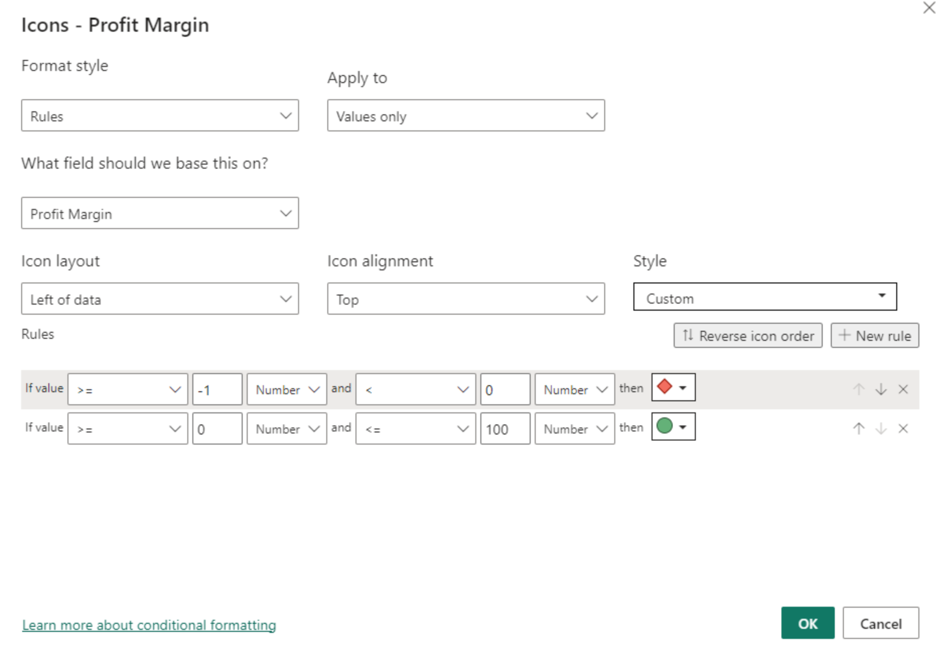
b. Add conditional formating
-
Under Visualizations -> Values, click on down arrow next to Profit Margin, select Conditional Formatting, select Icons.
-
Make the selection match with this screen and click OK.
- Drag and drop attributes from under Fields to values under Visualizations:
Explore the Drill Through option from Overview tab to Product Details page for different category options.
Bonus Report : Salesperson Performance
Add a new report page, rename it to Performance.
-
Add FiscalYear Filter
a. Select Filter visual, drag and drop DimDate : FiscalYear to Field, convert the filter to Dropdown.
-
Add Multi-row card visual for Sales, Target
a. Select multi-card visual, drag and drop FactSales : Sales, FactSalesQuota : Target to Fields.
b. Format the visual to change Card -> Bar Color to black and Background to gray.
-
Add Bar and Column charts for Sales and Target by Month
a. Add Clustered Bar chart visual, drag and drop DimDate : Month to Axis and FactSales : Sales, FactSalesQuota : Target to Values
Note: If the Target value is coming across same value for all years, its because relationship is not setup correctly. Go to correct this, go to Model view and Link FactSalesQuota : DateKey to DimDate : OrderDateKey
b. Copy paste the visual (a) on the same page, and change visual to Clustered Column chart.
Stage 4: Work with Interactions, Sync Slicers, Buttons and Bookmarks
Follow the instructions or demo steps for:
a. Interaction disable, enabled for Sales by Category
b. Add Sync Slicers to match this screen
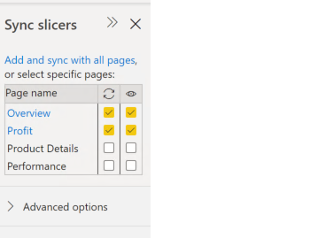
c. Add Buttons and Bookmarks to match this screen
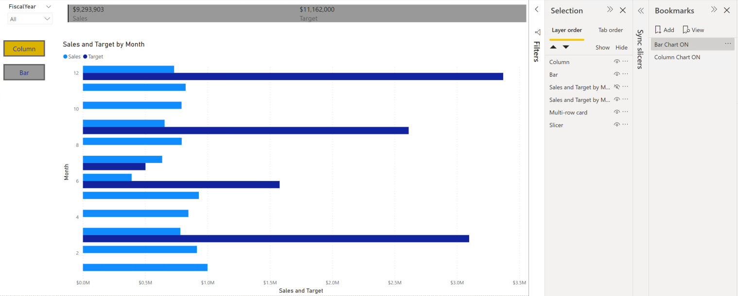
Stage 5: Publish to PBI Service
-
Apply sensitivity labels (if prompted) and save the report
-
Click on Publis button, sign in to your corporate or provided demo account (as applicable), choose the workspace (My Workspace in this case). Check with your instructor if there’s a team / shared workspace to be used.
-
Login to app.powerbi.com and explore the uploaded components (report and dataset) within the chosen workspace